Real case study / 01
SilkGearPremium Tech Retail
Helping shoppers move from seeing premium technology to understanding why a product fits their needs.
WhaleLeap handled website design and Shopify development. Selected product and collection pages show how design intent relates to the current storefront's product information, browsing, and purchase paths.
View SilkGear live store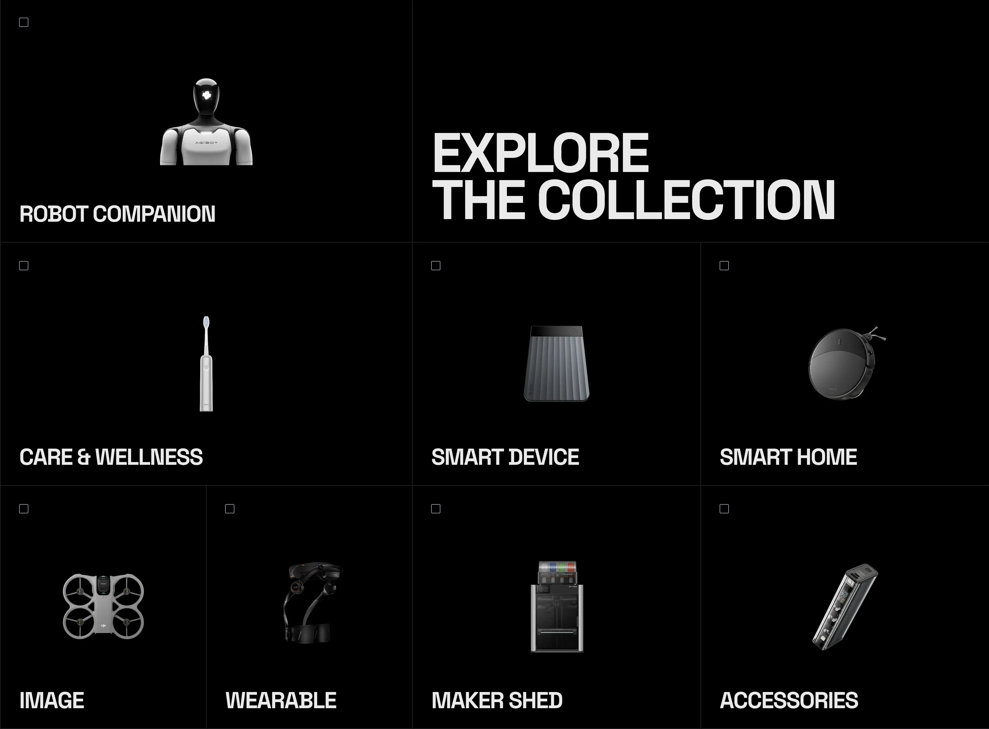
01 / Challenge
Many products, but specifications alone cannot make the decision.
SilkGear is an Australian technology retailer spanning robotics, smart devices, and outdoor mobility. The storefront needed to help first-time visitors understand use cases, narrow their choices, and reach a product decision.
02 / Scope
Website design and Shopify development.
WhaleLeap handled website design and Shopify development, with team designer ZIWEI contributing to the design. This case compares selected Hypershell desktop and mobile product pages and technology collection designs with the current live storefront.
03 / Diagnosis
The challenge was deciding what each layer should answer.
The homepage explains the product curation; collections narrow choices by need or device type; product pages place imagery, specifications, purchase actions, and reassurance in one decision context; store information connects online interest with an in-person visit.
04 / Decisions
Four decisions that make selection easier.
01
Organize discovery around use cases
Make category names and product purposes understandable so navigation helps shoppers filter choices.
02
Establish an editorial point of view
Introduce the SELECTED / OBSESSED product-curation position before Best Sellers and New Arrivals.
03
Support high-ticket product decisions
Keep hero imagery, alternate views, price, purchase actions, and related products in a continuous reading flow.
04
Keep the physical-store path visible
Continue to show the Melbourne store address, opening hours, contact details, and membership entry in the footer.
05 / Design to storefront
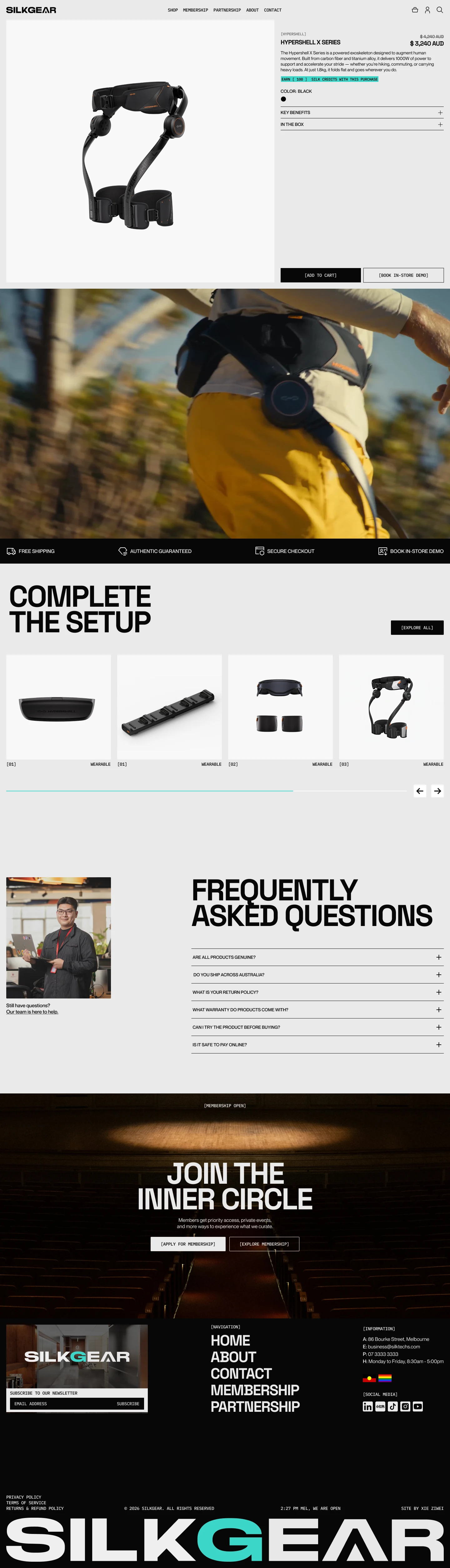
Hypershell: from product presentation to purchase choice.
A product like this needs to explain appearance, use cases, and buying options together. The design places these decisions in one view; the current storefront shows model choices, expandable product information, and purchase and in-store experience entries.
Desktop PDP · Figma design
Desktop PDP · current live first viewport
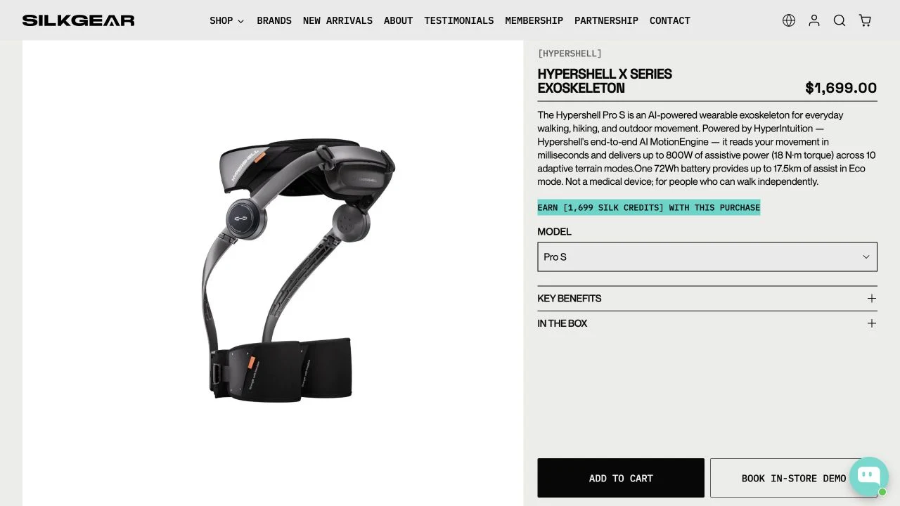
Live-store captures were taken on October 1, 2026. The design and current storefront are not the same version; these comparisons do not prove pixel-perfect reproduction or improved commercial performance.
06 / Mobile & collection
From collection browsing to mobile purchase.
Mobile PDP · Figma design

Mobile PDP · current live page

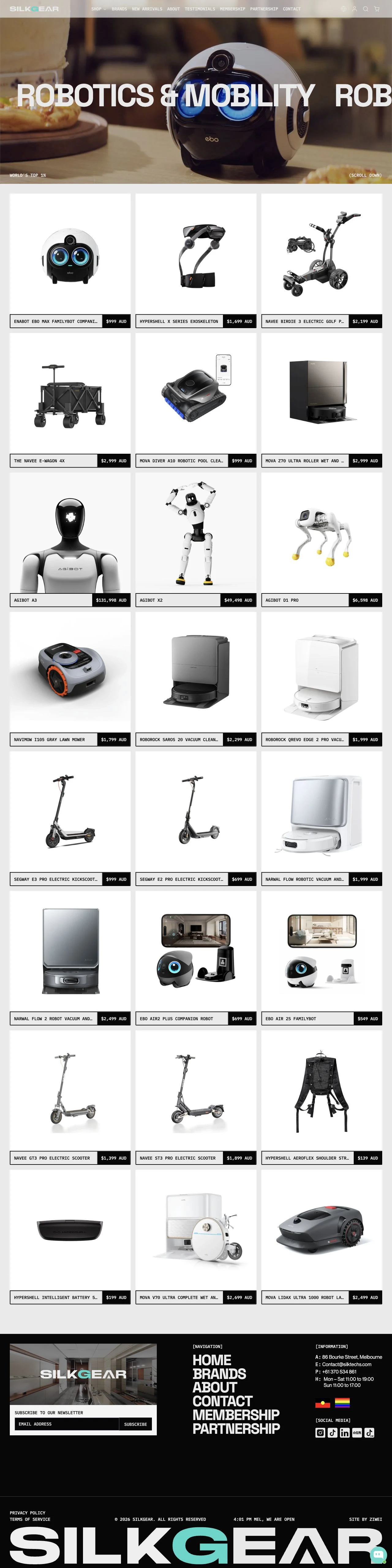
Collection · Figma design
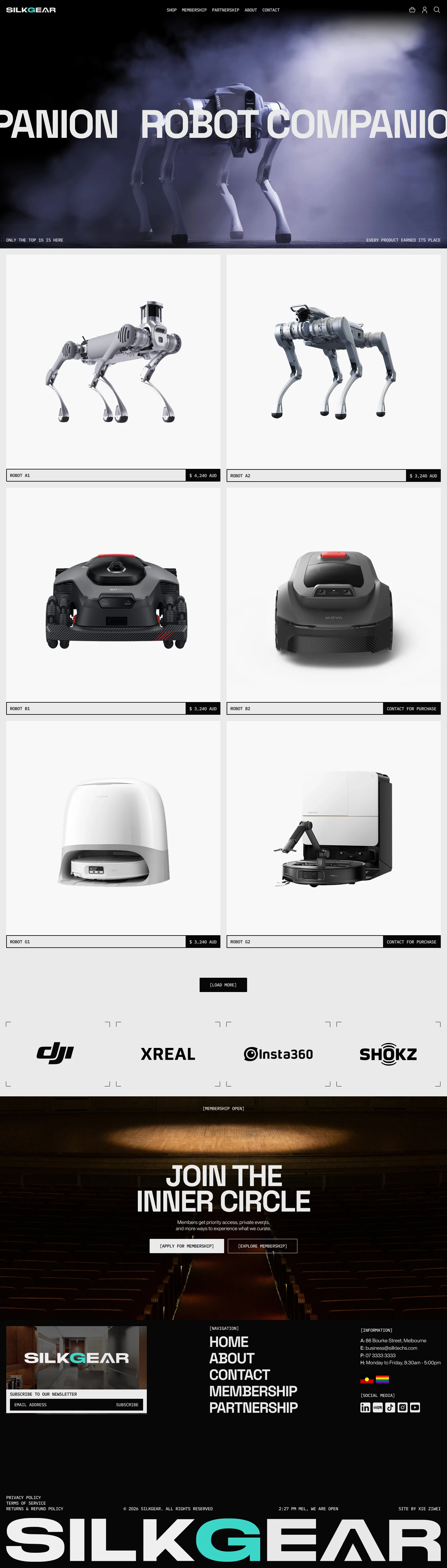
Collection · current live page
07 / Outcome
The verifiable outcome is a live retail journey.
Visitors can move from SilkGear's curation point of view to use-case collections, individual products, and purchase actions, with membership and Melbourne store information available afterward. A live storefront is not evidence of conversion lift; no unauthorized revenue or traffic figures are claimed here.
08 / Limitations
Three deliberate evidence boundaries.
- No unpublished admin, advertising, or commercial metrics are disclosed.
- Third-party apps, brand operations, and later content updates are not automatically attributed to WhaleLeap.
- Testimonials or percentage claims do not replace inspectable page evidence.
09 / Related service & guide
The transferable value is Shopify structure, not a copy of SilkGear's visual design.
The website-build service organizes brand, collection, PDP, and delivery boundaries into a maintainable system. The GA4 / GTM Tracking Plan explains how to define events and verify data after launch. They address different stages of the work.